Updates (id=22jun94)
June 22, 1994
It's summer, and the districts update is here. Things got moved around a lot since we last saw you all – and we do actually have someone to blame for that...
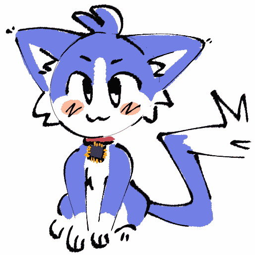
Meet our mascot, Pippin. He strolled right in here one day, knocked everything over, and made a huge mess. Putting everything back in order took its time, and now things look a little different around here.
It seems like he had nowhere else to go, so we kept him. In fact, for this update, we'd like to talk a little bit more about him (and our new look) and introduce him to all of you.
cats, colours and simpler times
Mascots are fun characters. But they can't just be fun, they have to make some sort of sense or relate to what they represent in some way. So what do you do when making a mascot character, and what should they be like? That's a question we had to ask ourselves.
We once talked to Victoria Wang, artist of Neocities and designer/creator of Penelope, its mascot. We asked her about her thoughts on fanart, and other things, including a curiosity we always had – why a cat?
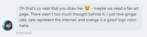
Her answer was simple, cats represent the internet.
It's true. Think about it; cats are such a widely featured animal on the internet. From memes, to people mass sharing images of their cats on social media, to dedicated accounts that are made just for individual and specific cats that gain their own following – cats really are the animal of the internet, as such.
Pippin himself was made with simplicity in mind. He's a fun character, but easy to draw, easy to remember and not complicated by any means. He's also meant to contrast with Penelope herself; Blue is the complementary color of orange. Penelope has a relatively rounded design, where as Pippin is full of sharp angles (and lots of extra fluff). Pippin is also a far more exagerrated and stylized character, being so fluffy, cartoony and expressive, and looking like he's been zapped by some loose wires – whereas Penelope is pretty much just a cat.
From there, we also thought about what else encapsulates the internet. We specifically ended up looking at sites from the 2000s and drawing inspiration from there, with their simple (and often blue) color schemes, clean designs and 1px solid borders. The site is also adorned in a bunch of new art and pixel decorations made especially for districts, and we have a new, simpler listing system. It doesn't even stop there – we're also mobile compatible at last. You can now check out districts on the go and at home.
We hope you'll all love the rebuild! We certainly do, and we're excited to show it off.
50+ sites have also been added, and some dead listings have been removed.